Work

01

Social Media

Content designed as a system: one visual language, repeated across a run of posts so the brand is recognisable at thumbnail size.

好吃 · Vegan Chinese Food

Art directionSocial adsPromo

Natural Fruit Smoothies

Product visualsColor series

Sucujut · Bebida Natural

PackagingProduct visualsFlavour rangeAI-generated
02

Flyers

Advertising pieces: a product launch, a summer campaign and a holiday sale. Each one gets a single frame to land its offer.

03

Posters

Film posters. Title, tone and genre compressed into one image, with no second impression to fall back on.

04

Brand Visual Identity

Two complete identities, shown as the boards themselves — exactly as they were composed, not rebuilt for the browser.

Case study Nº1 — Nueva Vida, Iglesia
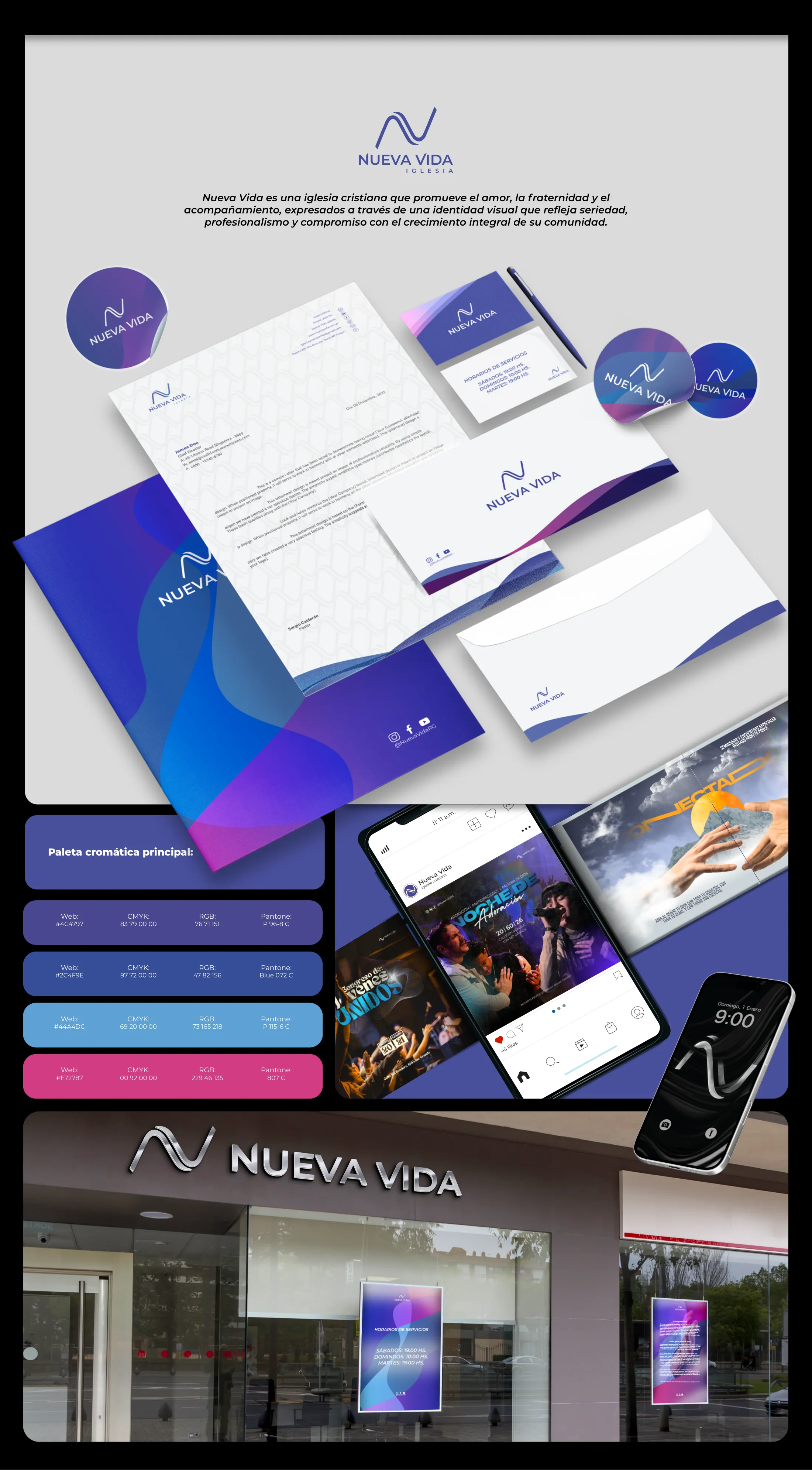
Nueva Vida brand identity board: the wave monogram logotype above the wordmark, a Spanish positioning statement, the stationery system laid out in perspective (folder, patterned letterhead, business cards, envelope and stickers in blue-violet gradients), the four-colour palette with Web, CMYK, RGB and Pantone values, social and event key visuals shown on phones, and the storefront with its metallic sign and window posters.

Case study Nº2 — NOA Deco & Accesorios
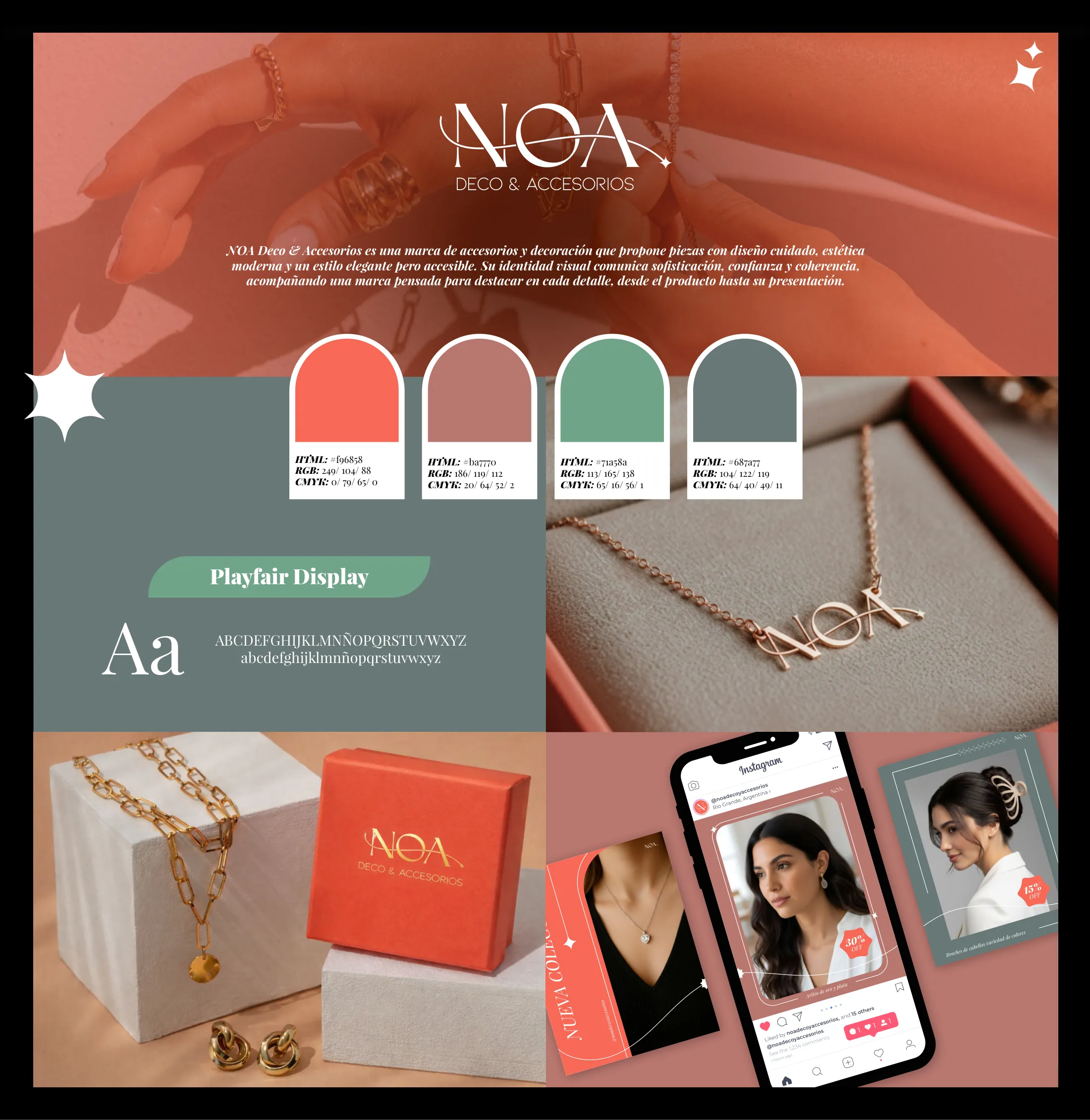
NOA Deco & Accesorios brand identity board: the logotype over a coral-tinted photograph of hands wearing the jewellery, a Spanish positioning statement, four arch-shaped palette chips carrying HTML, RGB and CMYK values, the Playfair Display type specimen on a sage panel, product and packaging photography, and the Instagram feed mocked up on a phone.